
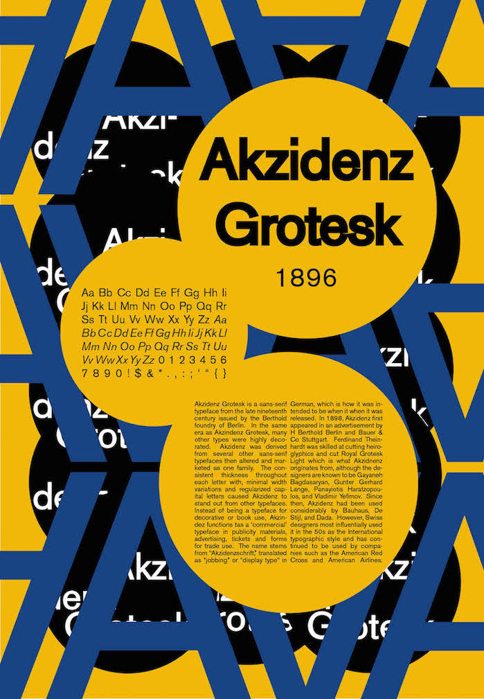
The final version I produced for the experimental poster, above on the left, consists of accurately using contrasting colors to compliment the use of negative space in an appropriate environment to depict the tone.
In the ultimate design of my traditional poster, on the right, I was successfully able to create a sense structure and easy flow to guide the eye of the reader while still presenting the necessary information.